
How to create amazing switch-toggle button using HTML and CSS
Hello Everyone,
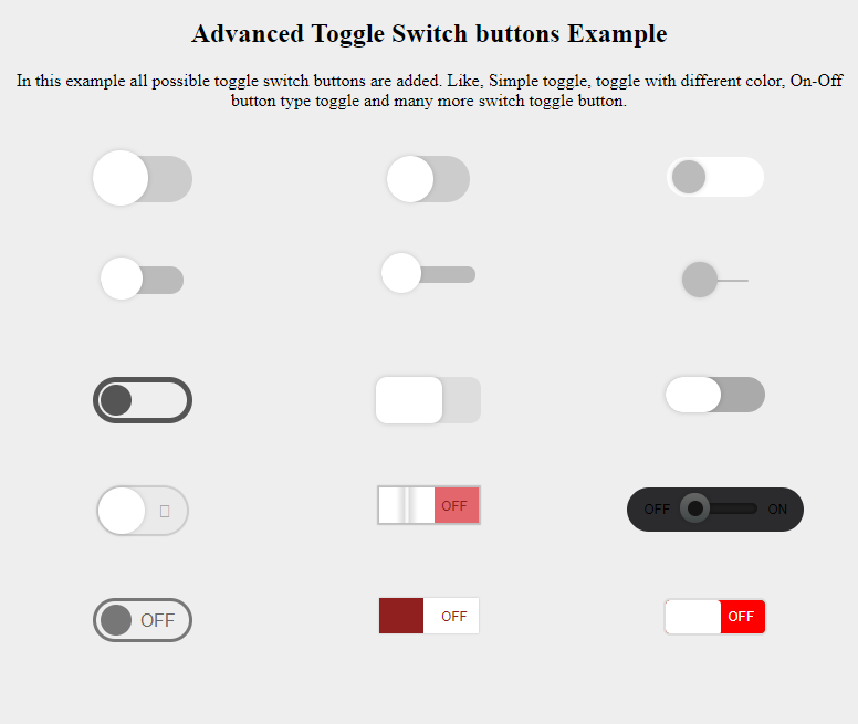
This is an advanced switch toggle button designed with HTML and CSS. This is really a complete example of a switch toggle button in HTML and CSS.
In this example, all possible toggle switch buttons are added. Like, Simple toggle, toggle with different color, On-Off button type toggle, and many more switch toggle button.
Total 15 Examples provided in this switch-toggle button design.
Demonstration Code How to make switch-toggle button
HTML Part to make a base switch-toggle:
<section>
  <div class="checkbox">
    <input type="checkbox" />
    <label></label>
  </div>
</section>
CSS Part for Base switch-toggle button design:
*,
*:after,
*:before {
  box-sizing: border-box;
}

body {
  text-align: center;
  background: #eee;
}

section {
  float: left;
  min-width: 150px;
  width: 33.33%;
  padding: 25px 0;
  min-height: 100px;
}

/*=====================*/
.checkbox {
  position: relative;
  display: inline-block;
}
.checkbox:after,
.checkbox:before {
  font-family: FontAwesome;
  font-feature-settings: normal;
  -webkit-font-kerning: auto;
  font-kerning: auto;
  font-language-override: normal;
  font-stretch: normal;
  font-style: normal;
  font-synthesis: weight style;
  font-variant: normal;
  font-weight: normal;
  text-rendering: auto;
}
.checkbox label {
  width: 90px;
  height: 42px;
  background: #ccc;
  position: relative;
  display: inline-block;
  border-radius: 46px;
  transition: 0.4s;
}
.checkbox label:after {
  content: "";
  position: absolute;
  width: 50px;
  height: 50px;
  border-radius: 100%;
  left: 0;
  top: -5px;
  z-index: 2;
  background: #fff;
  box-shadow: 0 0 5px rgba(0, 0, 0, 0.2);
  transition: 0.4s;
}
.checkbox input {
  position: absolute;
  left: 0;
  top: 0;
  width: 100%;
  height: 100%;
  z-index: 5;
  opacity: 0;
  cursor: pointer;
}
.checkbox input:hover + label:after {
  box-shadow: 0 2px 15px 0 rgba(0, 0, 0, 0.2), 0 3px 8px 0 rgba(0, 0, 0, 0.15);
}
.checkbox input:checked + label:after {
  left: 40px;
}
Let's do design for all 15 models -
HTML Part Full:
<!DOCTYPE html>
<html lang="en">
  <head>
    <meta charset="UTF-8" />
    <meta name="viewport" content="width=device-width, initial-scale=1.0" />
    <meta http-equiv="X-UA-Compatible" content="ie=edge" />
    <title>Advanced Toggle Switch buttons Examples</title>
    <link href="style.css" rel="stylesheet" />
  </head>
  <body>
    <div>
      <h2>Advanced Toggle Switch buttons Example</h2>
      <p>
        In this example all possible toggle switch buttons are added. Like,
        Simple toggle, toggle with different color, On-Off button type toggle
        and many more switch toggle button.
      </p>
    </div>

    <section class="model-1">
      <div class="checkbox">
        <input type="checkbox" />
        <label></label>
      </div>
    </section>

    <section class="model-2">
      <div class="checkbox">
        <input type="checkbox" />
        <label></label>
      </div>
    </section>

    <section class="model-3">
      <div class="checkbox">
        <input type="checkbox" />
        <label></label>
      </div>
    </section>

    <section class="model-4">
      <div class="checkbox">
        <input type="checkbox" />
        <label></label>
      </div>
    </section>

    <section class="model-5">
      <div class="checkbox">
        <input type="checkbox" />
        <label></label>
      </div>
    </section>

    <section class="model-6">
      <div class="checkbox">
        <input type="checkbox" />
        <label></label>
      </div>
    </section>

    <section class="model-7">
      <div class="checkbox">
        <input type="checkbox" />
        <label></label>
      </div>
    </section>

    <section class="model-8">
      <div class="checkbox">
        <input type="checkbox" />
        <label></label>
      </div>
    </section>

    <section class="model-9">
      <div class="checkbox">
        <input type="checkbox" />
        <label></label>
      </div>
    </section>

    <section class="model-10">
      <div class="checkbox">
        <input type="checkbox" />
        <label></label>
      </div>
    </section>

    <section class="model-11">
      <div class="checkbox">
        <input type="checkbox" />
        <label></label>
      </div>
    </section>

    <section class="model-12">
      <div class="checkbox">
        <input type="checkbox" />
        <label></label>
      </div>
    </section>

    <section class="model-13">
      <div class="checkbox">
        <input type="checkbox" />
        <label></label>
      </div>
    </section>

    <section class="model-14">
      <div class="checkbox">
        <input type="checkbox" />
        <label></label>
      </div>
    </section>

    <section class="model-15">
      <div class="checkbox">
        <input type="checkbox" />
        <label></label>
      </div>
    </section>
  </body>
</html>
CSS Part Full with 15 Models:
*,
*:after,
*:before {
  box-sizing: border-box;
}

body {
  text-align: center;
  background: #eee;
}

section {
  float: left;
  min-width: 150px;
  width: 33.33%;
  padding: 25px 0;
  min-height: 100px;
}

/*=====================*/
.checkbox {
  position: relative;
  display: inline-block;
}
.checkbox:after,
.checkbox:before {
  font-family: FontAwesome;
  font-feature-settings: normal;
  -webkit-font-kerning: auto;
  font-kerning: auto;
  font-language-override: normal;
  font-stretch: normal;
  font-style: normal;
  font-synthesis: weight style;
  font-variant: normal;
  font-weight: normal;
  text-rendering: auto;
}
.checkbox label {
  width: 90px;
  height: 42px;
  background: #ccc;
  position: relative;
  display: inline-block;
  border-radius: 46px;
  transition: 0.4s;
}
.checkbox label:after {
  content: "";
  position: absolute;
  width: 50px;
  height: 50px;
  border-radius: 100%;
  left: 0;
  top: -5px;
  z-index: 2;
  background: #fff;
  box-shadow: 0 0 5px rgba(0, 0, 0, 0.2);
  transition: 0.4s;
}
.checkbox input {
  position: absolute;
  left: 0;
  top: 0;
  width: 100%;
  height: 100%;
  z-index: 5;
  opacity: 0;
  cursor: pointer;
}
.checkbox input:hover + label:after {
  box-shadow: 0 2px 15px 0 rgba(0, 0, 0, 0.2), 0 3px 8px 0 rgba(0, 0, 0, 0.15);
}
.checkbox input:checked + label:after {
  left: 40px;
}

.model-1 .checkbox input:checked + label {
  background: #376fcb;
}
.model-1 .checkbox input:checked + label:after {
  background: #4285f4;
}

.model-2 .checkbox label {
  width: 75px;
}
.model-2 .checkbox label:after {
  top: 0;
  width: 42px;
  height: 42px;
}
.model-2 .checkbox input:checked + label {
  background: #4bd865;
}
.model-2 .checkbox input:checked + label:after {
  left: 35px;
}

.model-3 .checkbox label {
  background: #fff;
  border: 1px solid #eee;
  height: 38px;
}
.model-3 .checkbox label:after {
  background: #bbb;
  top: 3px;
  left: 5px;
  width: 30px;
  height: 30px;
}
.model-3 .checkbox input:checked + label:after {
  background: #3fb454;
  left: 55px;
}

.model-4 .checkbox label {
  background: #bbb;
  height: 25px;
  width: 75px;
}
.model-4 .checkbox label:after {
  background: #fff;
  top: -8px;
  width: 38px;
  height: 38px;
}
.model-4 .checkbox input:checked + label {
  background: #77c2bb;
}
.model-4 .checkbox input:checked + label:after {
  background: #009688;
  left: 40px;
}

.model-5 .checkbox label {
  background: #bbb;
  height: 15px;
  width: 85px;
}
.model-5 .checkbox label:after {
  background: #fff;
  top: -12px;
  width: 36px;
  height: 36px;
}
.model-5 .checkbox input:hover + label:after {
  transform: scale(1.4, 1.4);
}
.model-5 .checkbox input:checked + label {
  background: #b66d0b;
}
.model-5 .checkbox input:checked + label:after {
  background: #ff980f;
  left: 50px;
}

.model-6 .checkbox label {
  background: #bbb;
  height: 2px;
  width: 60px;
}
.model-6 .checkbox label:after {
  background: #bbb;
  top: -16px;
  width: 32px;
  height: 32px;
}
.model-6 .checkbox input:checked + label {
  background: #376fcb;
}
.model-6 .checkbox input:checked + label:after {
  background: #4285f4;
  left: 40px;
}

.model-7 .checkbox label {
  background: none;
  border: 5px solid #555;
  height: 42px;
}
.model-7 .checkbox label:after {
  background: #555;
  box-shadow: none;
  top: 2px;
  left: 2px;
  width: 28px;
  height: 28px;
}
.model-7 .checkbox input:checked + label {
  border-color: #329043;
}
.model-7 .checkbox input:checked + label:after {
  background: #3fb454;
  left: 50px;
}

.model-8 .checkbox label {
  background: #ddd;
  width: 95px;
  border-radius: 10px;
}
.model-8 .checkbox label:after {
  background: #fff;
  border-radius: 10px;
  top: 0;
  width: 60px;
  height: 42px;
}
.model-8 .checkbox input:checked + label {
  background: #ff980f;
}
.model-8 .checkbox input:checked + label:after {
  left: 35px;
}

.model-9 .checkbox label {
  background: #aaa;
  width: 90px;
  height: 32px;
  border-radius: 20px;
}
.model-9 .checkbox label:after {
  border-radius: 20px;
  top: 0;
  width: 50px;
  height: 32px;
}
.model-9 .checkbox input:checked + label {
  background: #266c33;
}
.model-9 .checkbox input:checked + label:after {
  background: #369a48;
  left: 40px;
}

.model-10 .checkbox:after {
  content: "\f00d";
  color: #aaa;
  position: relative;
  right: 30px;
  bottom: 15px;
}
.model-10 .checkbox:before {
  content: "\f00c";
  position: relative;
  left: 35px;
  bottom: 15px;
  color: #fff;
  z-index: 1;
}
.model-10 .checkbox label {
  width: 80px;
  background: #eaeaea;
  box-shadow: 0 0 1px 2px rgba(0, 0, 0, 0.15);
}
.model-10 .checkbox label:after {
  top: 0;
  width: 42px;
  height: 42px;
}
.model-10 .checkbox input:checked + label {
  background: #4bd865;
}
.model-10 .checkbox input:checked + label:after {
  left: 40px;
}

.model-11 .checkbox:after,
.model-11 .checkbox:before {
  content: "OFF";
  position: absolute;
  right: 10px;
  top: 10px;
  font-family: Arial, "Helvetica Neue", Helvetica, sans-serif;
  font-size: 12px;
  color: #90201f;
}
.model-11 .checkbox:before {
  content: "ON";
  left: -40px;
  z-index: 1;
  color: #266c33;
}
.model-11 .checkbox label {
  background: #e3666c;
  height: 32px;
  border-radius: 0;
  box-shadow: 0 0 1px 2px rgba(0, 0, 0, 0.2);
}
.model-11 .checkbox label:after {
  background-color: #ffffff;
  *zoom: 1;
  filter: progid:DXImageTransform.Microsoft.gradient(gradientType=1, startColorstr='#FFFFFFFF', endColorstr='#FFFFFFFF');
  background-image: url("data:image/svg+xml;base64,PD94bWwgdmVyc2lvbj0iMS4wIiBlbmNvZGluZz0idXRmLTgiPz4gPHN2ZyB2ZXJzaW9uPSIxLjEiIHhtbG5zPSJodHRwOi8vd3d3LnczLm9yZy8yMDAwL3N2ZyI+PGRlZnM+PGxpbmVhckdyYWRpZW50IGlkPSJncmFkIiBncmFkaWVudFVuaXRzPSJvYmplY3RCb3VuZGluZ0JveCIgeDE9IjAuMCIgeTE9IjAuNSIgeDI9IjEuMCIgeTI9IjAuNSI+PHN0b3Agb2Zmc2V0PSIzMCUiIHN0b3AtY29sb3I9IiNmZmZmZmYiLz48c3RvcCBvZmZzZXQ9IjQ1JSIgc3RvcC1jb2xvcj0iI2RkZGRkZCIvPjxzdG9wIG9mZnNldD0iNTAlIiBzdG9wLWNvbG9yPSIjZmZmZmZmIi8+PHN0b3Agb2Zmc2V0PSI1NSUiIHN0b3AtY29sb3I9IiNkZGRkZGQiLz48c3RvcCBvZmZzZXQ9IjcwJSIgc3RvcC1jb2xvcj0iI2ZmZmZmZiIvPjwvbGluZWFyR3JhZGllbnQ+PC9kZWZzPjxyZWN0IHg9IjAiIHk9IjAiIHdpZHRoPSIxMDAlIiBoZWlnaHQ9IjEwMCUiIGZpbGw9InVybCgjZ3JhZCkiIC8+PC9zdmc+IA==");
  background-size: 100%;
  background-image: linear-gradient(
    to right,
    #ffffff 30%,
    #dddddd 45%,
    #ffffff 50%,
    #dddddd 55%,
    #ffffff 70%
  );
  border-radius: 0;
  box-shadow: none !important;
  transition: 0.1s;
  top: 0;
  width: 50px;
  height: 32px;
}
.model-11 .checkbox input:checked + label {
  background: #4bd865;
}
.model-11 .checkbox input:checked + label:after {
  left: 40px;
}

.model-12 .checkbox {
  background: #2b2b2d;
  height: 40px;
  width: 160px;
  border-radius: 50px;
}
.model-12 .checkbox:after,
.model-12 .checkbox:before {
  content: "ON";
  font-family: Arial, "Helvetica Neue", Helvetica, sans-serif;
  line-height: 40px;
  font-size: 12px;
}
.model-12 .checkbox:before {
  content: "OFF";
  z-index: 1;
}
.model-12 .checkbox label {
  background: #1e1e1e;
  height: 10px;
  width: 70px;
  margin: 0 5px;
  box-shadow: 0 0 2px 2px rgba(0, 0, 0, 0.3) inset;
}
.model-12 .checkbox label:after {
  background-color: #3f4545;
  background-image: url("data:image/svg+xml;base64,PD94bWwgdmVyc2lvbj0iMS4wIiBlbmNvZGluZz0idXRmLTgiPz4gPHN2ZyB2ZXJzaW9uPSIxLjEiIHhtbG5zPSJodHRwOi8vd3d3LnczLm9yZy8yMDAwL3N2ZyI+PGRlZnM+PGxpbmVhckdyYWRpZW50IGlkPSJncmFkIiBncmFkaWVudFVuaXRzPSJvYmplY3RCb3VuZGluZ0JveCIgeDE9IjAuNSIgeTE9IjAuMCIgeDI9IjAuNSIgeTI9IjEuMCI+PHN0b3Agb2Zmc2V0PSIwJSIgc3RvcC1jb2xvcj0iIzY2NjY2NiIvPjxzdG9wIG9mZnNldD0iMTAwJSIgc3RvcC1jb2xvcj0iIzNmNDU0NSIvPjwvbGluZWFyR3JhZGllbnQ+PC9kZWZzPjxyZWN0IHg9IjAiIHk9IjAiIHdpZHRoPSIxMDAlIiBoZWlnaHQ9IjEwMCUiIGZpbGw9InVybCgjZ3JhZCkiIC8+PC9zdmc+IA==");
  background-size: 100%;
  background-image: linear-gradient(to bottom, #666666 0%, #3f4545 100%);
  top: -9px;
  width: 27px;
  height: 27px;
}
.model-12 .checkbox label:before {
  content: "";
  position: absolute;
  width: 14px;
  height: 14px;
  border-radius: 100%;
  transition: 0.4s;
  background: #151515;
  z-index: 3;
  left: 7px;
  top: -2px;
}
.model-12 .checkbox input:checked + label:after {
  left: 45px;
}
.model-12 .checkbox input:checked + label:before {
  background: #94da00;
  box-shadow: 0 0 5px #94da00;
  left: 52px;
}

.model-13 .checkbox:after {
  content: "OFF";
  font-family: Arial;
  position: absolute;
  color: #666;
  top: 12px;
  right: 15px;
}
.model-13 .checkbox label {
  background: none;
  border: 3px solid #777;
  height: 40px;
  border-radius: 20px;
}
.model-13 .checkbox label:after {
  content: "ON";
  font-family: Arial;
  color: #fff;
  line-height: 28px;
  text-indent: 100px;
  background: #777;
  overflow: hidden;
  box-shadow: none;
  border-radius: 14px;
  transform: translateX(-50px);
  -moz-transition: all 0.4s 0.2s, width 0.2s linear, text-indent 0.4s linear;
  -o-transition: all 0.4s 0.2s, width 0.2s linear, text-indent 0.4s linear;
  -webkit-transition: all 0.4s, width 0.2s linear, text-indent 0.4s linear;
  -webkit-transition-delay: 0.2s, 0s, 0s;
  transition: all 0.4s 0.2s, width 0.2s linear, text-indent 0.4s linear;
  top: 3px;
  left: auto;
  right: 2px;
  width: 28px;
  height: 28px;
}
.model-13 .checkbox input:checked + label {
  border-color: #329043;
}
.model-13 .checkbox input:checked + label:after {
  background: #3fb454;
  left: auto;
  transform: translateX(0px);
  -moz-transition: all 0.4s, width 0.2s linear 0.4s,
    text-indent 0.3s linear 0.4s;
  -o-transition: all 0.4s, width 0.2s linear 0.4s, text-indent 0.3s linear 0.4s;
  -webkit-transition: all 0.4s, width 0.2s linear, text-indent 0.3s linear;
  -webkit-transition-delay: 0s, 0.4s, 0.4s;
  transition: all 0.4s, width 0.2s linear 0.4s, text-indent 0.3s linear 0.4s;
  width: 80px;
  text-indent: 0;
}

.model-14 .checkbox:after,
.model-14 .checkbox:before {
  content: "OFF";
  position: absolute;
  right: 10px;
  top: 10px;
  font-family: Arial, "Helvetica Neue", Helvetica, sans-serif;
  font-size: 12px;
  color: #90201f;
}
.model-14 .checkbox:before {
  content: "ON";
  left: -40px;
  z-index: 1;
  color: #266c33;
}
.model-14 .checkbox label {
  background: #fff;
  height: 32px;
  border-radius: 0;
  box-shadow: 0 0 2px rgba(0, 0, 0, 0.2);
}
.model-14 .checkbox label:after {
  background: #90201f;
  border-radius: 0;
  box-shadow: none !important;
  transition: 0.3s;
  top: 0;
  width: 40px;
  height: 32px;
}
.model-14 .checkbox input:checked + label:after {
  background: #4bd865;
  left: 50px;
}

.model-15 .checkbox {
  width: 94px;
  height: 34px;
  border: 2px solid #ddd;
  background: #266c33;
  border-radius: 6px;
  overflow: hidden;
}
.model-15 .checkbox:after,
.model-15 .checkbox label:before {
  content: "ON";
  position: absolute;
  left: 10px;
  top: 8px;
  font-family: Arial, "Helvetica Neue", Helvetica, sans-serif;
  font-size: 12px;
  color: #fff;
}
.model-15 .checkbox label:before {
  content: "OFF";
  left: auto;
  top: 8px;
  right: 10px;
  z-index: 1;
}
.model-15 .checkbox label {
  background: #f00;
  width: 90px;
  height: 32px;
  border-radius: 4px;
}
.model-15 .checkbox label:after {
  border-radius: 4px;
  box-shadow: none !important;
  top: 0;
  width: 50px;
  height: 32px;
}
.model-15 .checkbox input:checked + label {
  transform: translateX(40px);
}
.model-15 .checkbox input:checked + label:after {
  left: 0;
}
If any more confusion about design, Please have a look at the code in Code-Sandbox. Code Sandbox-link - https://codesandbox.io/s/currying-shadow-bjt13
PHP If-else-elseif and Switch-case
PHP String Functions - All necessary String functions in PHP to manage strings better.
Popular Tutorials
Popular Tutorials
Categories
-
Artificial Intelligence (AI)
12
-
Bash Scripting
1
-
Bootstrap CSS
0
-
C Programming
14
-
C#
0
-
ChatGPT
1
-
Code Editor
2
-
Computer Engineering
3
-
CSS
28
-
Data Structure and Algorithm
18
-
Design Pattern in PHP
2
-
Design Patterns - Clean Code
1
-
E-Book
1
-
Git Commands
1
-
HTML
19
-
Interview Prepration
2
-
Java Programming
0
-
JavaScript
12
-
Laravel PHP Framework
37
-
Mysql
1
-
Node JS
1
-
Online Business
0
-
PHP
28
-
Programming
8
-
Python
12
-
React Js
19
-
React Native
1
-
Redux
2
-
Rust Programming
15
-
SEO - Search Engine Optimization
1
-
Tailwind CSS
1
-
Typescript
10
-
Uncategorized
0
-
Vue JS
1
-
Windows Operating system
1
-
Woocommerce
1
-
WordPress Development
2
Tags
- Artificial Intelligence (AI)
- Bash Scripting
- Business
- C
- C Programming
- C-sharp programming
- C++
- Code Editor
- Computer Engineering
- CSS
- Data Structure and Algorithm
- Database
- Design pattern
- Express JS
- git
- Git Commands
- github
- HTML
- Java
- JavaScript
- Laravel
- Mathematics
- MongoDB
- Mysql
- Node JS
- PHP
- Programming
- Python
- React Js
- Redux
- Rust Programming Language
- SEO
- TypeScript
- Vue JS
- Windows terminal
- Woocommerce
- WordPress
- WordPress Plugin Development